
Covercrete Colours: Choosing The Right Colour For Your Home
Choosing a covercrete colour is one of the few calls in a resurfacing job you can’t easily walk back, and most people make it with the wrong reference in front of them — a small printed swatch under shop lighting, or a thumbnail on a screen. The same covercrete colour on a real slab in real Gold Coast sun reads differently: a soft mid-grey can land on the driveway looking blue, and a warm beige can shift completely beside cream render, red brick or a terracotta roof.
This guide walks through the covercrete colours we work with at Spray Your Concrete, grouped by home style and surface, with practical colour choices for driveways, patios and pool surrounds. The aim is to get you to a shortlist of two or three before your on-site quote — not to pick the final colour off a screen.
I’ve spent twenty years resurfacing concrete across the Gold Coast and the Tweed. What follows is the same advice I give homeowners standing on their own driveway when they ask which way to go.
Ready to Revitalise Your Surfaces?
Contact Spray Your Concrete today for all your Gold Coast concrete resurfacing, epoxy flooring, and tile removal needs.
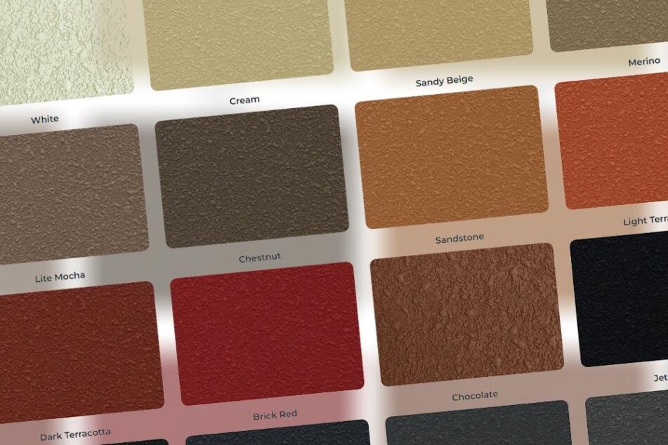
Covercrete Colours: The Full Colour Chart
Covercrete is the spray-applied base; the colour comes from the product system applied over it through our covercrete resurfacing service. Non-stencil work — driveways, patios, paths and pool surrounds — uses Shieldcoat Step Safe Heavy Duty, which comes in a wide standard range and tints to almost any custom colour. Stencilled finishes use the Dulux Avista range. Whichever system suits the job, the same colour thinking applies.
Final colour availability depends on the resurfacing system, finish type and surface condition, which we confirm during the quote.
Across the range, the covercrete colours span light neutrals, warm earth tones, cool greys and dark statement shades — set out in full in the table below. Check the final shade against a real sample board at the quote, since printed swatches shift under sunlight.
| Colour Family | Colours | Best Suited To |
| Warm Heritage Tones | Cream, Sandy Beige, Merino, Lite Mocha, Chestnut, Sandstone, Light Terracotta, Dark Terracotta, Brick Red, Chocolate | Queenslanders, Federation homes, brick homes, terracotta roofs and timber features |
| Cool Modern Greys | French Grey, Slate Grey, Bluegum, Bluestone, Silver Sands, Granite | Contemporary homes, coastal builds, rendered exteriors and minimalist designs |
| Natural Neutrals | White, Cream, Sandy Beige, Merino, Lite Mocha, Chestnut, Sandstone, Silver Sands | Mixed-material homes, gardens, patios and subtle driveway finishes |
| Dramatic Dark Shades | Charcoal, Gunmetal, Jet Black, Chocolate | Modern homes, dark trims, industrial-style exteriors and bold driveway finishes |
The sections below take each family in turn, then get practical about the best colours for driveways and for pool surrounds.
How to Choose the Right Covercrete Colour
Choosing a covercrete colour isn’t only about taste — it’s about the home, the surface, the sun, and how much upkeep you want to live with. Start with the home’s exterior: look at the brick, render, roof, fascia, garage door and existing paving, and pick a shade that sits beside them rather than fighting them. Mid-tones usually win — less stark than very light colours, less heavy than near-blacks. Then weigh the architectural style: Queenslanders, Federation cottages and older brick homes suit warm creams, beiges, mochas and terracottas, while modern, coastal and minimalist homes suit greys, charcoals and cooler neutrals. Factor in how the surface gets used — a driveway takes tyre traffic, a patio or pool surround gets walked on barefoot. And make the final call on-site, where Gold Coast sun, shade, surrounding walls and landscaping all change how a colour reads. For a fuller run-through of shade and layout, our guide to choosing the right colour and design covers it.
Warm Heritage Tones for Classic Homes
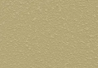
Warm covercrete colours suit homes with brickwork, timber features, cream render or terracotta roofing — Queenslanders, Federation-style homes, older suburban brick homes, and anything where the existing palette already leans warm. The shades that do the work here are Cream, Sandy Beige, Merino, Lite Mocha, Chestnut, Sandstone, Light Terracotta, Dark Terracotta, Brick Red and Chocolate.
The trick is to complement the home, not copy it. Sandy Beige or Merino sit easily beside cream render and softer brick; Sandstone or Light Terracotta hold their own against stronger earthy tones. A terracotta roof doesn’t need a terracotta driveway — matching the two usually reads as too much of one note, and a lighter warm neutral connects the slab to the home without weighing the whole exterior down. Chocolate and Dark Terracotta come into their own where there’s already strong timber or dark trim to anchor them.
cream 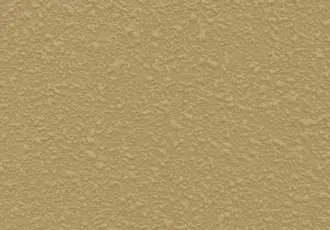
sandy beige 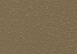
Merino 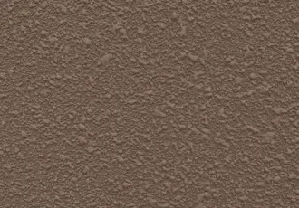
Lite Mocha 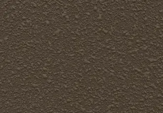
Chestnut 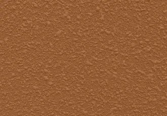
Sandstone 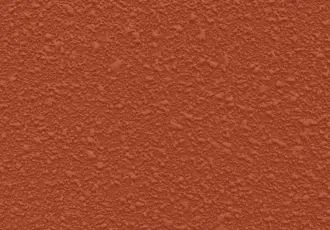
Light Terracotta 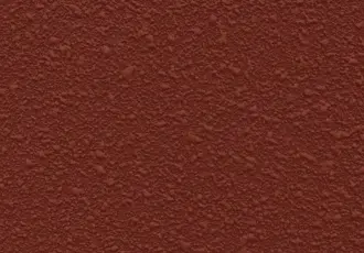
Dark Terracotta 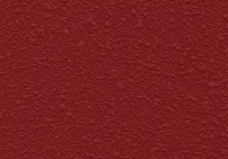
Brick Red 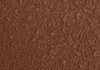
Chocolate
Cool Modern Greys for Contemporary Homes
Cool greys suit contemporary homes, coastal builds, rendered exteriors and minimalist designs — a clean, restrained look that pairs with white, charcoal, black and Colorbond-style roofing. The grey covercrete colours to know are French Grey, Slate Grey, Bluegum, Bluestone, Silver Sands and Granite.
Mid-grey is also the practical sweet spot for driveways: light enough to stay reasonably cool underfoot, dark enough to mask tyre marks. Of the mid-greys, Slate Grey and Granite hold up best — they don’t show tyre marks the way the lighter shades do, and they don’t fade as visibly as the near-blacks under Gold Coast UV. Worth knowing: Bluegum and Bluestone read cooler and more blue in real sunlight than on a brochure card, so check them against your render before committing. French Grey and Silver Sands sit lighter and work well on bright, crisp coastal exteriors.
French Grey 
Slate Grey 
Bluestone 
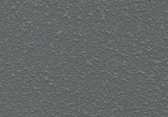
Granite 
Silver Sands
Natural and Neutral Covercrete Colours
Natural neutrals are the safe call when the home mixes materials — brick, render, stone, timber, fencing and garden edging. They let the resurfaced concrete settle into the property rather than dominate it. Cream, Sandy Beige, Merino, Lite Mocha, Chestnut and Sandstone are good starting points for driveways and patios where you want a warm, easy-to-live-with finish rather than a design feature.
Neutral doesn’t have to mean plain. Blend two or three related shades into a flecked finish and the result reads more textured and stone-like while staying understated — a good fit for established gardens, sandstone retaining walls or timber fencing.
Chestnut Sandstone Light Terracotta Chocolate French Grey Slate Grey Silver Sands
Dramatic Dark Shades for Bold Exteriors
Dark covercrete colours make a strong architectural statement — modern industrial-look homes, dark-roof contemporary builds, and low-contrast monochrome schemes. Charcoal, Gunmetal, Jet Black and Chocolate all work when they’re used with intent.
The trade-offs are heat and fade. A near-black patio or pool surround in full Gold Coast sun gets hot enough underfoot that you feel it through your soles — sometimes too hot for bare feet in the middle of the day. UV fade also shows more on a near-black slab, because there’s nowhere for it to hide. For driveways, Charcoal and Gunmetal are strong with modern dark trims or a darker roof; Jet Black is the one to think twice about — striking, but rarely the practical pick for hot, exposed areas.
Jet Black 
Charcoal 
Gunmetal Chocolate
Best Covercrete Colours for Driveways
The best covercrete colours for driveways are usually mid-tones. A driveway takes tyre traffic, foot traffic, leaves and weather, so the colour needs to be forgiving as well as good-looking. Very pale shades show tyre marks and staining sooner; very dark shades show dust, heat and UV fade more clearly.
For most Gold Coast driveways, Slate Grey, Granite, Sandy Beige, Merino, Lite Mocha, Chestnut and Sandstone are practical shortlist colours — they sit comfortably between appearance and maintenance and work across rendered, brick, coastal and newer suburban homes. A flecked finish is often the better driveway call: it hides small marks and surface variation better than flat colour. A grey-based fleck reads modern; a beige, mocha or sandstone fleck suits warmer, more traditional homes.
Best Covercrete Colours for Pool Surrounds and Patios
Pool surrounds and patios need a different lens, because comfort underfoot matters. These areas get used barefoot and cop strong afternoon sun, so very dark colours are best avoided around pools and exposed patios.
Lighter and mid-tone shades are more comfortable here — Cream, Sandy Beige, Merino, Silver Sands, French Grey and softer stone-style flecks all work depending on the home and landscaping, keeping the area feeling fresh without the heat of a near-black finish. The surrounds matter too: glass fencing, light pavers, rendered walls and water colour all change how the covercrete reads, so shortlist online, then view sample boards beside the actual pool before choosing.
Single Colour or Flecked Covercrete Finish
Once the colour direction is set, the last decision is one solid colour or a flecked finish.
A single colour gives a clean, uniform look that suits modern, minimalist spaces — though flat colour shows imperfections, staining and tyre marks more readily. A flecked finish blends two or three compatible covercrete colours, adding depth and hiding minor marks; for many driveways it’s the more practical, higher-end choice, giving a stone-like look without exposed aggregate or new concrete. Both sit within our decorative concrete options, and we work through the choice during the on-site quote.
Next Steps
Shortlist two or three covercrete colours that suit your home, the surface you’re resurfacing and the sun the area gets — then don’t make the final call from a screen. Book a covercrete quote with Spray Your Concrete and we’ll bring sample boards to the property so you can see the shades against the actual home in real Gold Coast light, as part of our covercrete service. We’re QBCC-licensed (Licence #1205294); for borders, accents and layout once the colour’s settled, our covercrete design tips are the next read. To book, call 1800 954 449.

